
WEMADE currently supports Gemini and Claude as official in-house AI tools and is expanding its AI adoption base. At the same time, the company operates the “AI Champions Council” to share the practical experience and know-how accumulated across departments, thereby enhancing AI capabilities throughout the organization.
This series introduces the real-world usage experiences of AI champions from various departments participating in the “AI Champions Council.” The first story features Manager Kim Ga-ram from the Management Control Team and her case study on automating monthly profit and loss(P&L) calculations.
As the monthly closing deadline approaches, Manager Kim Ga-ram of the Management Control Team gets very busy. This is because she must aggregate revenue and expenses by business unit and project and report the company’s profit and loss to senior management.
It was precisely this task that Manager Kim Ga-ram sought to automate using AI. She wanted to reduce the time spent manually organizing data in Excel and PowerPoint during the monthly process of compiling profit and loss(P&L) figures and preparing reports.
How was a business management professional with no coding experience able to automate the monthly profit and loss aggregation and reorganize the report—which used to span 50 PowerPoint slides—into a dashboard format? We asked Manager Kim Ga-ram directly.
ㅤ
Q. First, what kind of work are you responsible for in the Management Team?
I’m in charge of FP&A (Financial Planning & Analysis) in the Management Team of the Financial Management Office. I prepare the company-wide profit and loss statements and management accounting data, and I aggregate monthly revenue and expenses by business unit and project to report on profit and loss. I also prepare analytical reports to support executive decision-making.
ㅤ
Chapter 1.
The Starting Point of Automation: Numbers Piling Up Every Month, But No Time to Analyze Them.

Q. Among your responsibilities, which task did you want to automate using AI? Why did you choose that task?
I targeted the monthly compilation of the company’s profit and loss (P&L) statement for automation. The essence of this task isn’t merely compiling numbers; it involves explaining why those numbers were generated and proposing a direction for the following month.
However, in practice, repetitive tasks—such as gathering figures from each business unit, combining them, aggregating them by category for verification, and formatting the reporting tables—ended up taking up a significant portion of my time. There were even days when this task alone took 5 to 6 hours. We also had to repeatedly communicate with subsidiaries to request MM (Man-Month) data, compile the data, and verify it.
I should have been spending more time on analysis and deriving insights—the core tasks of FP&A—but instead, I was losing a lot of time to data organization and formatting. So I wanted to use this opportunity to change that structure.
ㅤ
Q. How did you determine the direction for automation?
The direction was clear. “Let’s build a system where, once it’s set up, we just need to update the data every month.”
I wanted Excel to automatically generate the aggregates once I entered the new monthly data, and I wanted to switch from creating a new PowerPoint presentation every time to a dashboard where I could click to view detailed figures. So, I divided the work into two main areas for automation.
One was automating the Excel file itself that handles profit and loss data, and the other was converting the organized data into a reporting dashboard. Additionally, I automated part of the request email process that I had to repeat every month.
ㅤ
Chapter 2.
Excel Automation: Reducing Repetitive Profit and Loss Calculations.
Q. What was the first task you tackled?
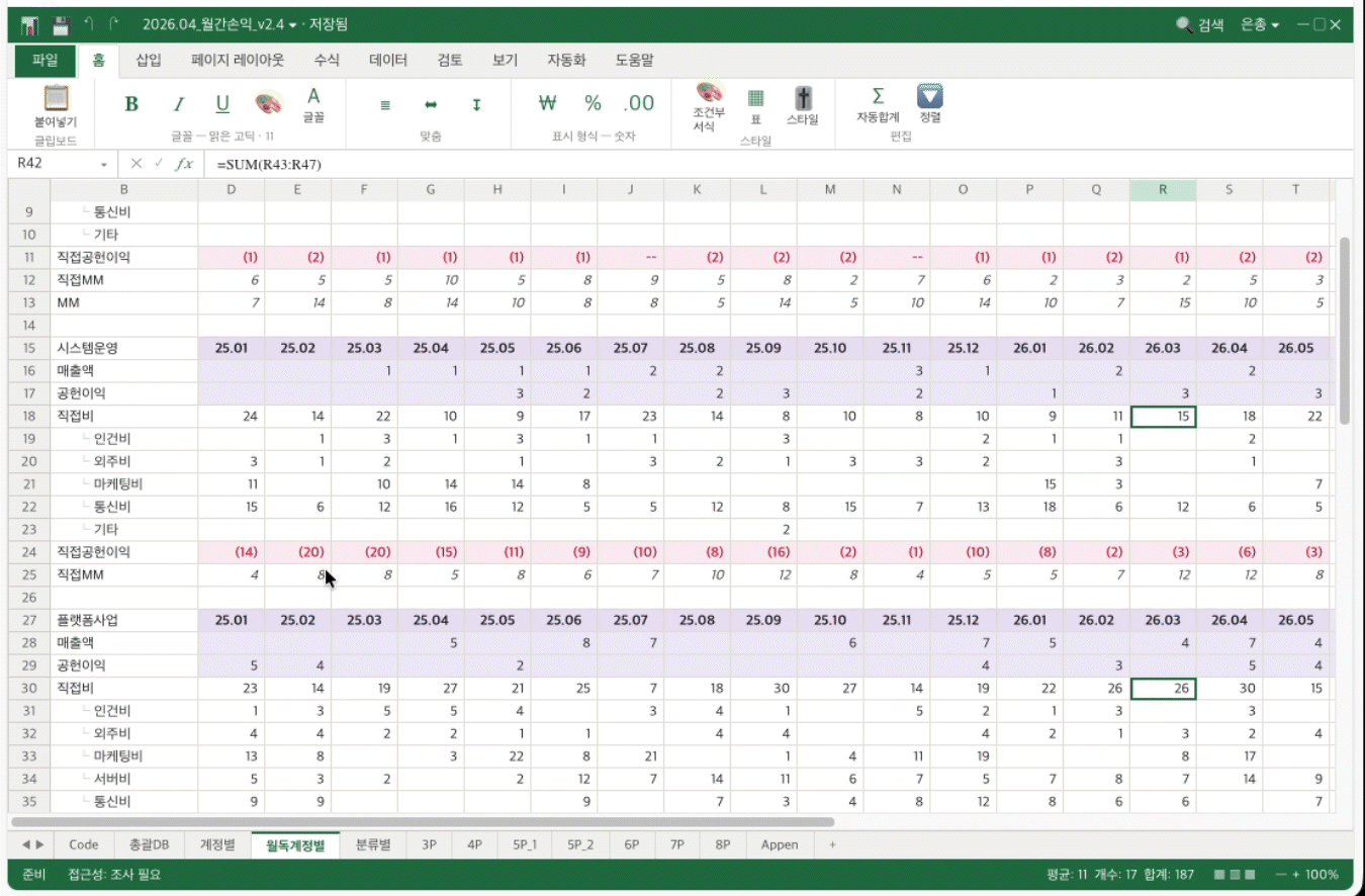
First, I started by optimizing the Excel profit and loss management file I was in charge of.
The existing file was based on a consolidated database of about 30,000 rows, and it used SUMIFS formulas across various aggregation sheets—by game, blockchain, and category—to pull in revenue, contribution margin, direct costs, operating profit, and MM from various aggregation sheets—such as by game, blockchain, and category—into specific accounts and projects.
Because the raw data was so large and the formula references were intricately intertwined, the file itself became bulky and slow. Even changing a single formula caused the computer to lag, and it took quite a while to figure out how a change in one place would affect other sheets.
Additionally, whenever data was added to the consolidated data sheet—the general ledger that serves as the starting point for profit and loss aggregation—we had to manually expand the formula ranges on each sheet, and tasks such as regenerating pivot tables or reformatting the data had to be repeated every month.
ㅤ
Q. How did you solve this?
I used Claude in Excel. This feature allows you to chat directly with the AI while the Excel file is open, enabling you to adjust formatting or work on worksheets.
With it, I replaced heavy formulas with lighter, more efficient ones to improve the file’s processing speed. Additionally, I switched to a dynamic reference structure where the data range automatically expands, ensuring that new data added to the ledger is automatically reflected in the summary sheet without having to manually adjust formula ranges.
We also eliminated the need to regenerate pivot tables or reformat the data. Now, simply pasting new data into the ledger updates the key summary figures all at once.
ㅤ
Q. What changes have you actually seen in Excel work time or work methods?
Whereas about 70% of the entire workflow used to consist of manual tasks, that figure has now dropped to around 10%, excluding areas that absolutely require direct verification.
Now, simply by changing the month on the report sheet, the figures are automatically calculated and the charts update in tandem. The total time spent on Excel tasks, including table generation, has been cut nearly in half.
Rather than just saving time, eliminating manual data entry and adjustments has freed us up to spend more time rechecking and interpreting the numbers.
ㅤ
Chapter 3.
Excel Automation: The Next Step—Changes in Reporting Methods.
Q. Why did you want to switch to a dashboard format for your reports?
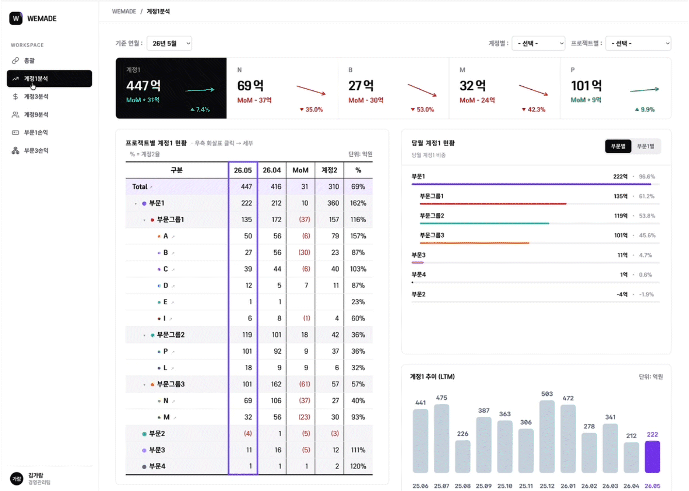
Typically, reports are created in PowerPoint and then saved as PDFs for sharing. However, even when reviewing a single profit and loss statement, questions like “What are the profits and losses for each game?” or “What’s the status of other projects?” inevitably follow.
It’s difficult to respond immediately to these questions using only static PDF documents. At the same time, it’s not feasible to create a PowerPoint slide for every detail every time. That’s why I’ve long felt the need for a drill-down dashboard where I can click to view detailed figures.
Coincidentally, drew inspiration from a dashboard example created by a colleague from another department who participated in the AI Champions Council. After seeing that example, I thought it would be great to create my own HTML dashboard tailored to my work that would allow me to examine profit and loss data in greater detail.
ㅤ
Q. In what order did you start building the dashboard?
Instead of inputting the data right away, I focused on establishing the screen structure. Since I already had the data, the key was figuring out how to display these figures intuitively.
I referenced various dashboard templates to define the basic layout and used Claude Design to map it out. For example, I placed five key metric cards at the top, kept certain tables as fixed elements, and visualized items that require clear comparison—such as revenue—using bar charts. In short, I built the framework of the screen beforehand.
Afterward, I populated it with actual data and implemented the finalized structure using Claude Code. If I had written the code first and then tried to change the design later, it would have taken twice the time and effort. Conversely, by finalizing the layout before writing the code, I significantly reduced the number of iterative revisions caused by positioning or layout issues.
ㅤ
Chapter 4.
Each AI tool had its own role
Q. How did you categorize and utilize AI tools for each stage of the workflow?
After trying them out, I found that each tool excels at different tasks, so I naturally ended up using them separately.
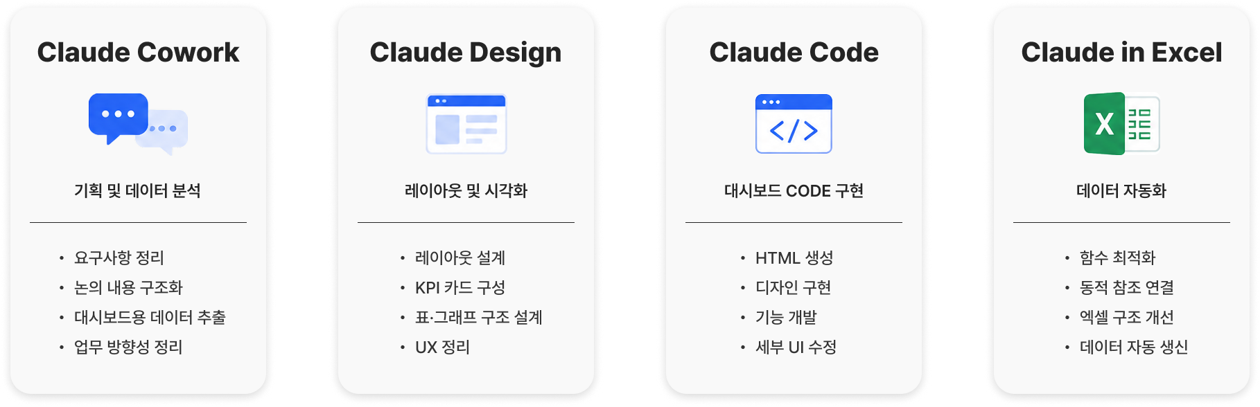
I used Claude Cowork to organize planning and requirements. It was more like a conversation to set the direction of the work, such as “What flow should this follow?” or “Which items should be shown first?” Cowork also helped me quickly extract data or organize structures.
I used Claude Design to establish the layout and visual structure of the dashboard. Even without knowing any code, I could provide direction verbally—such as “Move this block to the right” or “Make the color tone a bit more subdued”—which made the design decision-making process much smoother. As someone who is neither a designer nor a developer, it felt like I’d finally acquired the language to describe a “reporting interface.”
I used Claude Code to implement the finalized layout as actual HTML and to tweak specific features. Its role was to examine the file structure and insert code where needed—essentially applying patches.
When editing the Excel file itself, I used Claude in Excel. Since I could chat directly via the sidebar while the file was open, my workflow wasn’t interrupted when checking formulas or setting up dynamic reference structures.
Dividing the tasks among these tools made each stage much cleaner. Rather than trying to handle everything with a single tool, dividing the work into planning, design, implementation, and Excel tasks proved to be much more efficient in the end.
ㅤ
Chapter 5.
Use AI, but Don’t Blindly Trust It
Q. What was the most difficult part of the process?
The hardest part was that things often didn’t get modified the way I wanted. The dashboard is now up to version 28. Since I explained the requirements interactively, there were times when the AI arbitrarily changed a structure that was working well or when the numbers got messed up.
There were also quite a few instances where unwanted elements—such as borders, fonts, sizes, and margins—shifted alongside the intended modifications. There were even three or four times when I couldn’t restore the original version at all. After that, I developed the habit of saving intermediate versions periodically.
Whenever I hit a roadblock, rather than trying to fix the whole thing at once, I broke it down into the smallest units I could verify myself. If the dashboard screen didn’t work as intended, I’d check one tab or one item at a time to find where the problem was, and then make another request to the AI.
Ultimately, I realized that using AI effectively depends on how well you break down and explain the problem and how thoroughly you verify the results.
ㅤ
Q. Were there moments when you felt you shouldn’t blindly trust the AI’s suggestions?
Plenty. There was a time when the AI confidently replied, “Just use this function,” but it turned out to be a function that didn’t even exist. I implemented it exactly as suggested, and the page wouldn’t even load.
Even during the Excel automation process, there was a time when a formula suggested by the AI conflicted with the existing sheet structure, causing the total for a specific tab to drop to zero. That’s when I truly realized that the AI doesn’t fully understand the entire structure before providing an answer.
So since then, rather than taking the AI’s answers at face value, I always double-check which cells were modified and why, and whether the changes affected other sheets.
ㅤ
Q.Accuracy seems especially important in financial work. How do you verify the results generated by the AI?
I always manually verify the integrity of the numbers themselves.
When modifying formulas in Claude in Excel, I set it up to highlight which cells were altered and provide an explanation for the changes. This ensures that if a problem arises, I can easily trace where the error occurred.
I structured the workflow based on the principle, “I can make my own judgment by seeing where and why the AI made changes,” rather than assuming, “It must be correct because the AI fixed it.”
On the dashboard as well, since the data displayed on screen must match the source data down to the last digit, I designed it so that verified source data is displayed directly, rather than having the AI recalculate the numbers.

ㅤ
Q.Was there a particular outcome from this project that made you feel the most proud?
One of the things I was most proud of was creating a BAT file system that allows me to handle monthly recurring data updates with a simple double-click.
Simply put, a BAT file is an automated script that executes a set of predefined tasks all at once. I set it up so that when the newly updated data files are placed in a designated folder each month and the BAT file is double-clicked, the dashboard files automatically read the new data and refresh to display the latest information.
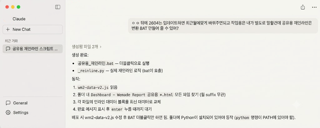
While it might not be a technically sophisticated feature, I found great satisfaction in how it reduced tedious, repetitive monthly tasks to fit my workflow. In practice, I realized that simply eliminating these small repetitions brought a noticeable boost to efficiency.
ㅤ
Chapter 6.
Reduced Repetitive Tasks, Getting Closer to Core Work
Q. What changes have occurred in your work environment since implementing Excel automation and building the dashboard?
The biggest change is that I can now dedicate the time previously spent on repetitive tasks to more critical work. In the past, I spent hours copying data, adjusting tables, and formatting layouts. Now, I can use that time to double-check the figures and add meaningful insights.
As I mentioned at the beginning, the essence of FP&A work isn’t just about compiling figures—it’s about explaining why those metrics moved. Now that repetitive tasks have been reduced, I feel like I’m getting closer to that core mission.
ㅤ
Q. Do you have any advice for non-technical colleagues who feel daunted by the idea of using AI?
You don’t need to know how to code. After all, AI can help with writing and implementing it.
The important thing is to accurately describe what you do. If there are tasks you repeat manually every day, start by breaking down the process step by step and explaining it to the AI. If you can articulate what data you’re looking at, how you’re categorizing it, and what kind of final output you need, I think you’re already halfway there.
It might feel unfamiliar and time-consuming at first. But once you’ve established a structure, you can reduce recurring monthly tasks, freeing up time for more important work.
If there’s a task in your workflow that repeatedly eats up your time, I hope you’ll give it a try—even on a small scale.
ㅤ
ㅤ
Manager Kim Ga-ram’s Dashboard Design Prompt Revealed
If you’d like to reference Manager Kim Ga-ram’s workflow, try using the prompt below. This is an example of the dashboard design method explained in the interview, restructured into a prompt format.
Download the prompt MD file
AI Champion Notes will continue to share real-world experiences with AI applications gathered from various departments.